Designing a logo is always a magical process. What makes something memorable and beautiful? It's rare to document the full design process, with all the alternatives and errors, but as we are building a platform for developers to show how they work, we used it to record how we created our visual identity.
By the way, if you are reading this and you are a designer, you might not know the rubber duck methodology. It’s a technique that you explain a topic to a rubber duck and in the process of articulating your ideas, you can better understand the problem you are dealing with. It's a very common technique used by programmers when they need to better understand a problem in their code.
We think that’s a powerful learning method for both the person doing it or anyone watching it. We believe so much on this method, that we decided to create a platform to allow developers to easily do rubber duck debugging. This platform is called GitDuck and allows programmers to record and share their code, screen and microphone recording in one place. You can see a demo here.

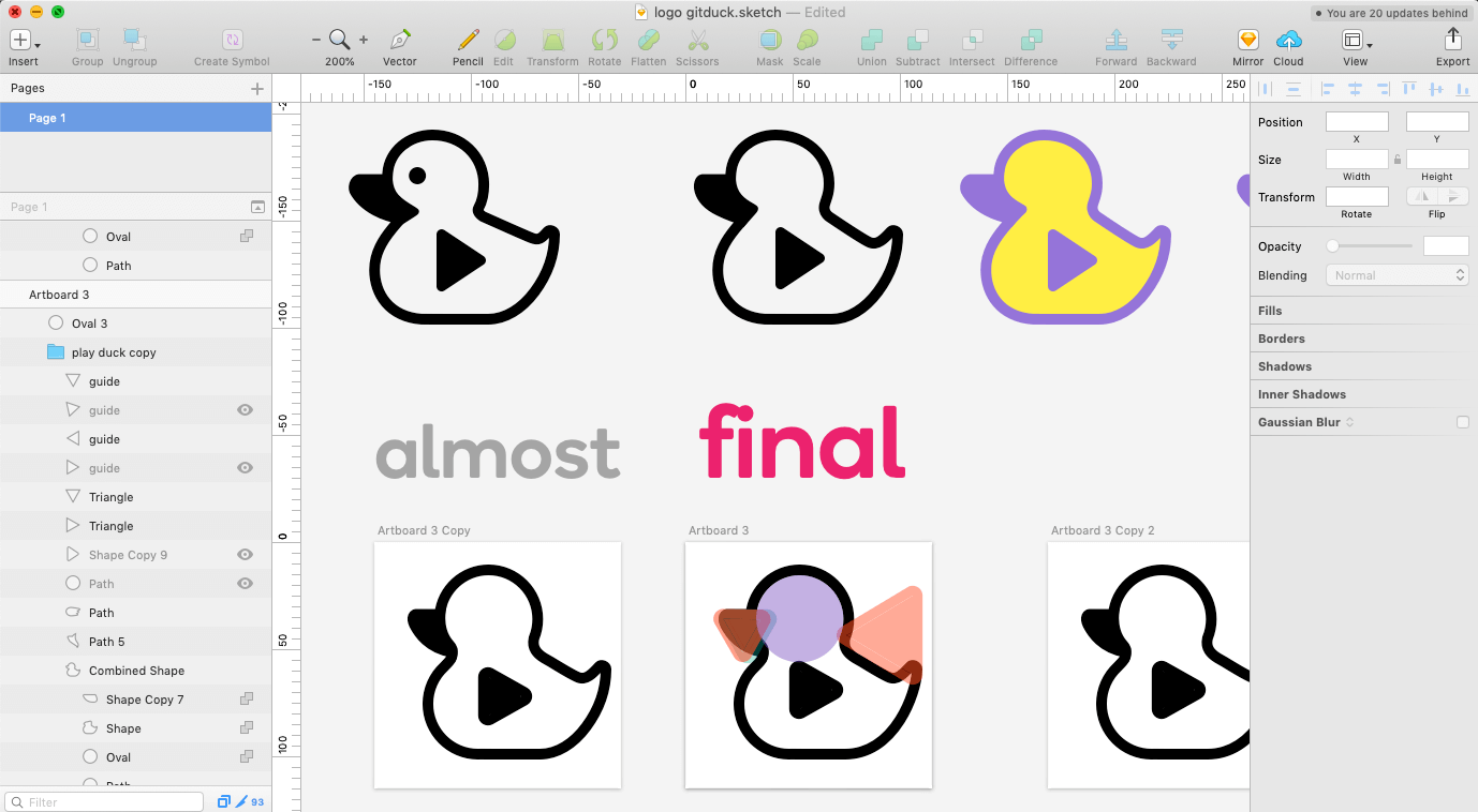
We started designing our logo from a duck icon, but as our platform is generating videos, we thought would be nice to add a play button to the duck. Honestly, we didn't know if it would work.
We used GitDuck to record all our design process. Check the time-lapse of the logo creation. It's funny how fast we got to the final (kind of) version, but then we had to do a lot of fine tuning to make the logo perfect for all situations.
This is the process we followed.
- We started with a duck icon,
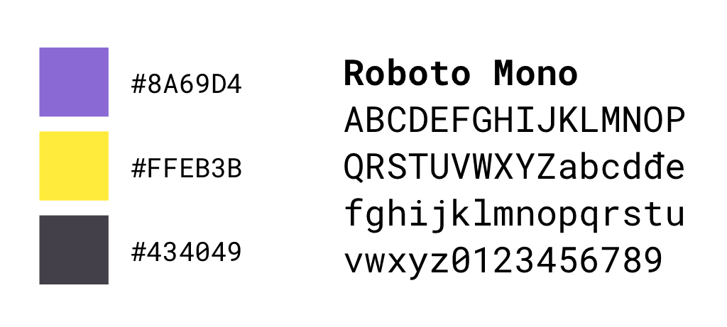
- applied the brand colors,
- added a play button and
- made a lot of fine adjustments to it. In total, we worked almost 3 hours in the logo (not counting the time we were thinking about it).
The final result 👇

What do you think about it?
Check more about GitDuck at https://gitduck.com or watch some of the recent coding sessions here.
Thank you.